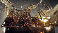
Ok, I think I have finally completed my week #3 project study on the 'coke text splash image.' I find it very helpful to take it step-by-step watching the recordings in blackboard and working my projects at the same time. It allows me to take each individual step more carefully and hopefully more accurately, too. This is far from perfect, however. One particular problem I had was getting enough contrasting highlights, shadows and depth in my text in both Illustrator as well as Photoshop to get enough difference before using the magic wand to separate each to do the techniques described in the recordings to get the differences. I ended up making a couple more layers of the text image in Photoshop and highlighting or darkening each individually as needed before using the magic wand to make my differences more unique. Does that make sense? Anyway, it seemed to work ok, maybe just not as well as explained in the recording. Then I chose three separate layers for my blends: vivid light, hard light and overlay. Using a combination of all three blends and adjusting the opacity of each to get to the look I wanted, I think it finally turned out to be a fairly good reproduction of the original piece. It's a far cry from perfect and I know there are areas I need improvement upon a great deal. But never-the-less here is the final result for this weeks FINAL project.

Once again, the original from where my inspiration came, to the left. Below is my representation (and YES, high res images do make all the difference)!


Great job on this! Yes, getting the 3D letter contrast is difficult. You really have to fish around in the settings in Illustrator and then in Photoshop with the levels to get good enough contrast to work with.
ReplyDelete