Saturday, May 21, 2011
Week 1 Project Study Second Attempt
Original
'Don't Tempt Fate' poster
My second attempt:
In a further study of the 'Don't Tempt Fate' poster, I tried several more intense techniques. I first did a simple vector drawing of the apple in Illustrator. I then did another simple vector drawing of the ribbon using techniques I learned layering in a 3D effect and added an outline, then added the word 'Tempt' on top typed along a vector path to follow the pattern of the ribbon shape. I also typed both the words 'Don't' and 'Fate' in Illustrator, preparing each image for transition to Photoshop. Once I imported the apple image into Photoshop I started building layers. One vector outline image layer of the apple in black imported from Illustrator and then made a second copy and changed the color to white, then I enlarged the size of this image just slightly to outline the black outline image of the apple. Next, I 'painted and shaded' the inside of the apple image in another layer using several shading and highlighting techniques and colors. This image I copied into a new document and gave it a half-tone effect set at 12 and round dots pattern. Next I colored yet another layer red using highlights and shading where necessary. Once all my layers were complete, I layered them accordingly before flattening the image with a transparent background to import into a new Photoshop document. My sunburst background image I created 2 layers: one a painting technique using yellows and reds and then a second layer using a half-tone effect to create my sunburst pattern. I flattened this image before importing it into the document with the apple image. I then imported one at a time each word: 'Don't' and 'Fate' and followed several 'grunge effect' techniques I learned for the typeface effect shown. Once each was completed, I copied them into the final document with the other images. I added a final layer as newsprint and made it the background image before multiplying some of the layers on top to allow some of the newsprint to show through. I flattened the complete document as one piece to submit for my final product.
Tuesday, May 17, 2011
Having some issues...
Original
'Don't Tempt Fate'
Poster
My version
Having some problems with this one. I'm not sure how to re-create the 'newsprint' effects on the apple...it's not exactly film grain but I know I've seen you demonstrate it in class before I just can't remember how to do it. Also some other minor issues may be clear to see....any ideas or a 'how-to' video would be most appreciative! Thanks a bunch!
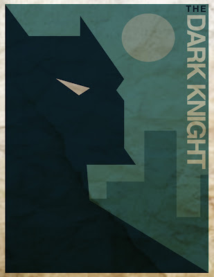
The Dark Knight...Reproduced:

The original
'Dark Knight' poster
My reproduction
I first did a very simple vector drawing in Illustrator adding color and included the text. I rotated the 'Dark Knight' text -90 degrees. I then grouped the entire image and imported it into Photoshop to add a crumpled paper layer effect underneath before multiplying the 'Dark Knight' layer on top, then flattened the entire image.
Monday, May 16, 2011
These are the two Images I've Decided to Reproduce ....
I will first recreate the Dark Knight poster as a simple vector drawing and color in Illustrator then combine it with a textured paper image in Photoshop.
Next, I will try recreating the 'Don't Tempt Fate' poster using vector drawings in Illustrator and combining it with textures in Photoshop.
Next, I will try recreating the 'Don't Tempt Fate' poster using vector drawings in Illustrator and combining it with textures in Photoshop.
Subscribe to:
Comments (Atom)


