Saturday, May 28, 2011

Week #2 FINAL-'Cathouse' Project

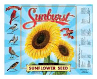
Here is my inspiration piece:


Experimenting with textures:

I first created my images doing simple vector drawings in Illustrator finding my inspiration in the image found above. I decided to tell a story with my recreation of the images I chose before I copied it into Photoshop to give it some effective blends to further tell it's story.
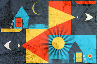
The linear light blend shows a great deal of the concrete floor with footprints texture I used.  Perhaps the most texture of the three I chose.  If you look closely, you can almost see the footprints here.  One can only imagine a night stalker scoping out and then breaking into the house, then the surprised reaction of the event the next day!

The color burn blend shows off the most vibrance of the colors even though it doesn't show the texture a great deal, as do the other versions.  Yet somehow this version gives a whole other feeling to the story...somehow more mysterious, more dramatic, perhaps due to the bright, bold colors used.

And the hard light blend is a subtle blend of both the images I created and the concrete floor with footprints texture.  A somewhat calmer version perhaps, yet still very effective.

I think each blend, each texture can tell a quite different story or give a contrasting different version to the same piece, thus enhancing it's many moods.  It's interesting to me how you can feel one way using one blend or texture while feeling altogether different using another one.

Friday, May 27, 2011

Week #2 Project Study-'Cathouse'


    This is the original image I've been studying this week for our second project.  I am still struggling to find my comfort zone within Illustrator so I felt this would be a good study project for me to become more comfortable with basic vector drawings.  I also am still struggling with texture techniques and obtaining good quality high resolution images for reproduction, so I also tried my hand at some techniques learned with that as well.


    My versions of the images above as well as below are recreated with both a tea stained textured paper effect and a coffee stained textured paper effect, all-be-it only slightly different effects, unique non-the-less.  I recreated the images (which I now affectionately refer to as the 'Cathouse' project) both in Illustrator and Photoshop.  I first recreated my images as simple vector drawings in Illustrator using techniques I learned this week on the blackboard recordings.  I have learned that there is a great value to copying images for best reproduction of each side of an image using these techniques.


    Once each image in it's own contained 'box' was complete I grouped the entire image together and copied it into Photoshop where I was able to add a texture layer on top of the image and used the blending effect Linear Burn for the best result.  Several blending modes were quite interesting but this particular blend mode brought out the vibrant colors best and allowed me to use the textured paper layer more effectively.  I used both a tea stained paper texture image as well as a coffee stained paper texture image.  Both gave very nice effects I thought. The tea stained a slightly more vibrant look and the coffee stained a more dulled look.  Both very nice though and I'm not sure which one I like best.  I do like this technique a great deal and I've learned this week that resolution from internet art DOES MATTER so always look for the highest res you can for best effects!

    For my final project of the week I'll recreate a similar version of the above images mixing it up a bit into my own version.  I will use the same techniques I've learned here.  Sorry for the delay this week in submitting my work.  It's been a crazy week with the terrible weather we had earlier as well as end-of-the-school-year events with my kids.  Back on track now however, thanks.


Sunday, May 22, 2011

Week 2 Project Ideas:

I may take a further look into some previous ideas for week # 2's project OR take an entirely different route instead:


Week 1 Project: COMPLETE!


Here is my final image (hopefully) using half-tone techniques as studied before in the 'Don't Tempt Fate' poster. 

My inspiration came from some sunflower poster art I found online as well as some decor from my own kitchen (I like sunflowers).  I first did a simple vector drawing in Illustrator of the sunflower image I liked before importing the image into Photoshop to add some shading techniques to the stem, leaves and center of the sunflower.  I created a half-tone layer on the stem, leaves and center of the sunflower.  I layered the sunflower in Photoshop then flattened the image before copying it into the final document.  The final document background is a newsprint faded in the background with another layer on top which is a sunburst technique created in Illustrator with a half-tone screen effect as well.  I imported the sunburst image into Photoshop and added a background layer which was created with a painted effect using various hues, then flattened the image.  I copied that image into the final document on top of the newsprint background image and then did a Hard Light effect to allow the background newsprint to show through as well as keep the sunburst image vibrant.  Next, I created the ribbon image in Illustrator including the word 'Sunshine' on top using techniques I learned through my earlier studies.  I imported this image into Photoshop as a top layer onto the final document, on top of the sunflower image.  Next, I created my header, 'Grow Some' as two separate images in Illustrator before importing them into Photoshop and adding texture effects learned, which includes a metal texture background, before layering them on top of the entire final document image.  Once the entire poster was created in Photoshop, I flattened the entire image and saved it at a lower resolution to upload to the web.

 
Inspirational pieces for my final document.