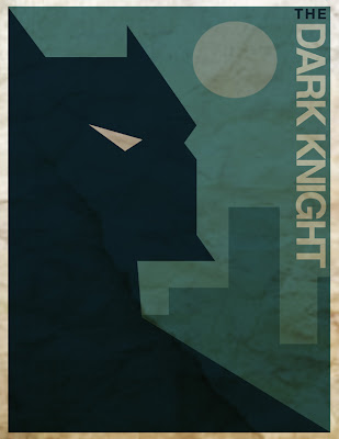
The original
'Dark Knight' poster
My reproduction
I first did a very simple vector drawing in Illustrator adding color and included the text. I rotated the 'Dark Knight' text -90 degrees. I then grouped the entire image and imported it into Photoshop to add a crumpled paper layer effect underneath before multiplying the 'Dark Knight' layer on top, then flattened the entire image.

Good job Kim! Was it easier than you thought. For your original you might try a more complex vector drawing like the one you showed with the house. Also make sure you have a really high resolution image for the texture. Yours on Batman looks a little blurry. It would be a good idea to collect textures and if you have access to a scanner to make your own.
ReplyDeleteThis one was way easier than I thought. And yes, even though I found a pretty high res crumpled paper art for my background, I still had to enlarge it so I figured I'd lose some in it. Thanks for the feedback and if you could give me some pointers on the other image I'm working on too, that'd be SUPER! It's a little more complex and I'm struggling with some of the cool texture effects like the newsprint screen...I know it should be easy but so far I'm having troubles. Thanks.
ReplyDelete