Here is my final image (hopefully) using half-tone techniques as studied before in the 'Don't Tempt Fate' poster.
My inspiration came from some sunflower poster art I found online as well as some decor from my own kitchen (I like sunflowers). I first did a simple vector drawing in Illustrator of the sunflower image I liked before importing the image into Photoshop to add some shading techniques to the stem, leaves and center of the sunflower. I created a half-tone layer on the stem, leaves and center of the sunflower. I layered the sunflower in Photoshop then flattened the image before copying it into the final document. The final document background is a newsprint faded in the background with another layer on top which is a sunburst technique created in Illustrator with a half-tone screen effect as well. I imported the sunburst image into Photoshop and added a background layer which was created with a painted effect using various hues, then flattened the image. I copied that image into the final document on top of the newsprint background image and then did a Hard Light effect to allow the background newsprint to show through as well as keep the sunburst image vibrant. Next, I created the ribbon image in Illustrator including the word 'Sunshine' on top using techniques I learned through my earlier studies. I imported this image into Photoshop as a top layer onto the final document, on top of the sunflower image. Next, I created my header, 'Grow Some' as two separate images in Illustrator before importing them into Photoshop and adding texture effects learned, which includes a metal texture background, before layering them on top of the entire final document image. Once the entire poster was created in Photoshop, I flattened the entire image and saved it at a lower resolution to upload to the web.

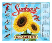
Inspirational pieces for my final document.


Good job Kim. I just wish you had used a higher resolution image for your background, the newspaper thing looks really blurry. Given some time I think you could find or scan another image into the background, it would be worth it.
ReplyDeleteYes I know it wasn't as crisp at it should be. I had trouble finding a vintage newsprint I liked at high res. Guess I should have just scanned a newspaper instead. Even larger images online are not always good enough. How do you tell how high the resolution is anyway? I mean you can download a LARGE image but it's not going to be more than 72dpi so I guess it's still not high enough res to use then, right? Apparently not. Just can't always trust online art.
ReplyDeleteWhen you open a file in Photoshop you check the image size and count the pixels. In a google image search it will tell you the pixel size of the image before you even click on it. For printing it needs to be 300dpi at the size you want it to print in inches. For example if you want something to print out the size of a 4 x 6 postcard you would need 1800 pixels wide by 1200 tall.
ReplyDelete